Skip to main content
Microsoft
Universal Windows Platform App Development Using Visual Studio 2017
Microsoft launched Visual Studio 2017 last week. Today, in this article, I am going to talk about how to download Visual Studio 2017, how to install VS17, how to create new Universal Windows Platform (UWP) app using Visual Studio 2017; and will also talk about some basic features of Visual Studio, app deployment, Universal Windows Emulator and some common controls of UWP apps, available on Visual Studio 2017.
You can download Visual Studio 2017 from here.
For this article, I am using Visual Studio 2017 Professional Version.

Figure 1: Visual Studio 2017 Professional version download page
Download and save web installer of Visual Studio 2017. If you download VS 2017 now, you can claim for a 60-day free trial license of Xamarin University.

Figure 2: Xamarin University trial license offer
Once you download and click on the web installer, you will see the VS privacy settings page like below.


Figure 3: Visual Studio installation file loading
Click «Continue» on the above page to start the installation process of VS 2017.

Figure 4: Visual Studio 2017 installation process
No Visual Studio installation process will start. You need to select from the Workloads the one you want to install.

Figure 5: Visual Studio 2017 installation process
Here, for UWP app development, I have selected Universal Windows Platform development from the Windows workload.

Figure 6: Visual Studio 2017 individual component selection
Here, I have added a few more components. My installation is almost full installation of VS17 with all the features, that’s why the size is bigger — more than 46 GB.

Figure 7: Visual Studio 2017 language packs selection
You can select your own language from the language packs selection option. Once you click on the «Install» button, the installation will begin.

Figure 8: Visual Studio installation
As the installation begins, you can see the above screen.

Figure 9: Starting Visual Studio
Once the installation is done, you need to restart your computer and launch Visual Studio. For the first time, the above screen will show. It will take a few minutes to launch Visual Studio for the first time.

Figure 10: Initial page of Visual Studio 2017
The above screen is the initial page of Visual Studio 2017. If developer mode is off, then the below screen will appear on your pc and prompt you to toggle the developer mode ON.

Figure 11: Settings page to on Developer mode
Once you turn on the developer mode, now you can use visual studio 2017 to develop the UWP app.

Figure 12: Visual Studio 2017 to create new project

Figure 13: VS 17 project template for UWP
Now, you need to select your project type. Here, I have selected a Blank App – Universal Windows. You need to select the target version and minimum supported version now.
I have selected Windows 10 Anniversary Edition as a target version and Windows 10 as the minimum version.

Figure 14: Target and minimum version selection
A new Universal Windows Platform project is created, and now, you can develop the UWP app in Visual Studio 2017.
Now, click on the mainpage.xaml from Solution Explorer to see the designer section on VS17.

Figure 14: Designer Section
From the toolbox, drag and drop text block control in the designer section and modify the text to “Universal Windows Platform App Development”. Your design should look like the above figure.

Figure 15: Running Universal Windows app on VS17
There are a lot of options for us to run our UWP app. We can run our app on,
- Local machine
- Remote machine
- Device
- And different Windows phone mobile emulators

Figure 16: Splash screen after running the Universal Windows app
You can select any option from figure 15 to run the app. Here, I have selected a local machine to run my first app. At first, it will take some time to run the app. It will build the app first and then run.

Figure 17: Universal Windows Platform app on a local machine
In the running app, we can see a black bar at the top. This bar is to see UI layout properly and its contents. We can see display layout adcorners and positions of each controls on the app.

Figure 18: Display layout adcorners on local machine simulator
Now, close the local machine simulator and you will notice Live Visual Tree from the left section of Visual Studio 2017. You can see the hierarchy of the UI on the Live Visual Tree section.

Figure 19: Live Visual Tree of Visual Studio 2017
You can run the app on the Windows Phone emulator as well. Here, I have selected a Windows phone emulator with 2 GB RAM. It will take some time to load the emulator and run it. Once you run the app, it will look like this.


Figure 20: UWP app on Windows Phone emulator
Now, we will work with different controls of the Universal Windows Platform.
HyperlinkButton
Now, we’ll work with another Button like control called “HeyperLinkButton”. It’s used to link a URL or some other things you like.
To do that, you can see Toolbox on the left side of Visual Studio and you can find it in the “All XAML Controls” section. Click on this control and drag it to your design. Like this,

Figure 21
Now, to make sure it works, we need another TextBlock control. To do so, drag it from the Toolbox and put it below the Hyperlink button. The designing code is given below.
- <HyperlinkButton x:Name=«HyperlinkButton_1»
- Content=«HyperlinkButton»
- HorizontalAlignment=«Left»
- VerticalAlignment=«Top»
- Margin=«10,10,0,0»
- Click=«HyperlinkButton_1_Click»
- Grid.Column=«0»
- Grid.Row=«0»
- Width=«114»
- Height=«50»/>
- <TextBlock x:Name=«HB_TextBlock»
- HorizontalAlignment=«Left»
- VerticalAlignment=«Top»
- TextWrapping=«Wrap»
- Height=«50»
- Width=«124»
- FontSize=«24»
- Grid.Column=«1»
- Grid.Row=«0»
- Margin=«10»/>
Listing: 1
Here, in HyperlinkButton, we have an event controller named HyperlinkButton_1_Click. It creates a code block that will handle the background task when you will click on the hyperlink button and we will be shown a confirmation message in the TextBlock named HB_TextBlock.
Making Grid
We have made some Grids in our main Grid to arrange the controls in these Grids, like Grid 1, 2 and so on. You can make Grids wherever you want and customize the Grid as your need.
- <Grid Background=«{ThemeResource ApplicationPageBackgroundThemeBrush}»>
- <Grid.RowDefinitions>
- <RowDefinition Height=«70*»/>
- <RowDefinition Height=«80*»/>
- <RowDefinition Height=«68*»/>
- <RowDefinition Height=«93*»/>
- <RowDefinition Height=«145*»/>
- <RowDefinition Height=«124*»/>
- <RowDefinition Height=«60*»/>
- </Grid.RowDefinitions>
- <Grid.ColumnDefinitions>
- <ColumnDefinition Width=«60*»/>
- <ColumnDefinition Width=«40*»/>
- </Grid.ColumnDefinitions>
- </Grid>
Listing: 2
Now, the main Grid will look like this.

Figure 22
You can define Row Definitions, a number of rows along with their width and Column Definitions according to their width. We have seven rows and two columns here.
Now, open MainPage.xaml.cs and put the code below the constructor.
- private void HyperlinkButton_1_Click(object sender, RoutedEventArgs e)
- {
- HB_TextBlock.Text = «OK»;
- }
Listing 2
Now, run the application and it will look like the picture below once you click on the hyperlink button.


Figure 23
Working with RadioButton
Well if you can do that, then you are on move. Now, we take another control name RadioButton, and drag it from TextBlock and put it in another Grid and also a TextBlock in Row 1. The customized code will look like this, or you can simply drag a control and test separately; it’s up to you. I suggest you to do as I did.
So, our design will look like this.

Figure 24
and the designing code is below.
- <RadioButton x:Name=«RadioButton_1»
- Content=«RadioButton»
- HorizontalAlignment=«Left»
- Margin=«10,4,0,0»
- Grid.Row=«1»
- Grid.Column=«0»
- VerticalAlignment=«Top»
- Checked=«RadioButton_1_Checked» Height=«66» Width=«114»/>
- <TextBlock x:Name=«RB_TextBlock»
- HorizontalAlignment=«Left»
- VerticalAlignment=«Top»
- Margin=«10,10,0,0»
- TextWrapping=«Wrap»
- Height=«60»
- Width=«124»
- FontSize=«24»
- Grid.Column=«1»
- Grid.Row=«1»/>
Listing 3
Here, like HyperlinkButton, in our RadioButton, we have also an event handler named RadioButton_1_Checked, and in our event handler, we will show the confirmation message whether checked or unchecked.
- private void RadioButton_1_Checked(object sender, RoutedEventArgs e)
- {
- if (RadioButton_1.IsChecked == true)
- {
- RB_TextBlock.Text = «Checked»;
- }
- else
- {
- RB_TextBlock.Text = «Not checked»;
- }
- }
Listing 4
Here, we’re checking whether our RadioButton is checked or not. If it’s checked (true), the TextBlock will show “Checked”; and if it’s unchecked (false), the TextBox will show “Not checked”.
After you run your application, it’ll look exactly like this.


Figure 25
Working with TextBlock
Another control we rapidly use in our every application is TextBlock. We’ve used it in our previous controls also. We will show static data in our TextBlocke.x., “Hello world”.
The design will look like this.

Figure 26
Designing code is below.
- <TextBlock Text=«Hello world»
- HorizontalAlignment=«Left»
- Margin=«10,10,0,0»
- Grid.Row=«2»
- TextWrapping=«Wrap»
- VerticalAlignment=«Top»
- Height=«40»
- Width=«380»
- FontSize=«24» Grid.ColumnSpan=«2»/>
Listing 5
We don’t need any Button or event handler in this case, cause the text is given statically in the design (Text=”Hello world”).
After you run your application, it’ll look exactly like this.


Figure 27
Working with ToggleSwitch
Another control we’ll talk about is ToggleSwitch. It’s really a beautiful control that will make your application cooler than before. I think you know, how to use control now, we have done it before. So, just take this control and take another TextBlock, and the design will look like this.

Figure 28
The designing code is below,
- <ToggleSwitch x:Name=«ToggleSwitch_1»
- Header=«ToggleSwitch»
- Margin=«10,10,0,0»
- Grid.Row=«3»
- VerticalAlignment=«Top»
- Toggled=«ToggleSwitch_1_Toggled»
- Width=«196»
- Height=«73»/>
- <TextBlock x:Name=«TS_TextBlock»
- HorizontalAlignment=«Left»
- VerticalAlignment=«Top»
- Margin=«10,10,0,0»
- TextWrapping=«Wrap»
- Height=«73»
- Width=«124»
- FontSize=«24»
- Grid.Column=«1»
- Grid.Row=«3»/>
Listing 6
We have an event handler here, so the C# code is given below.
- private void ToggleSwitch_1_Toggled(object sender, RoutedEventArgs e)
- {
- if (ToggleSwitch_1.IsOn == true)
- {
- TS_TextBlock.Text = «This is On»;
- }
- else
- {
- TS_TextBlock.Text = «This is Off»;
- }
- }
Listing 7
We did the same logic here as the RadioButton.
After you run your application, it’ll look exactly like this.


Figure 29
Working with ListBox
Our fifth control will be ListBox, its data binding control. It’s an important control which has some complicated structure. So let’s see how we can use it in our application.
Like other controls drag it from Toolbox and put in the Grid. Here, we need a Button and TextBlock controls.
The design will look like this,

Figure 30
The designing code is given below,
- <ListBox x:Name=«ListBox_1»
- HorizontalAlignment=«Left»
- Height=«120»
- Margin=«10,10,0,0»
- Grid.Row=«4»
- VerticalAlignment=«Top»
- Width=«196»
- ScrollViewer.VerticalScrollBarVisibility=«Visible»>
- <ListBoxItem Content=«January»/>
- <ListBoxItem Content=«February»/>
- <ListBoxItem Content=«March»/>
- <ListBoxItem Content=«April»/>
- <ListBoxItem Content=«May»/>
- <ListBoxItem Content=«June»/>
- <ListBoxItem Content=«July»/>
- <ListBoxItem Content=«August»/>
- <ListBoxItem Content=«September»/>
- <ListBoxItem Content=«October»/>
- <ListBoxItem Content=«November»/>
- <ListBoxItem Content=«December»/>
- </ListBox>
- <Button Content=«Ok»
- x:Name=«Ok»
- Grid.Column=«1»
- HorizontalAlignment=«Left»
- Margin=«10,10,0,0»
- Grid.Row=«4»
- VerticalAlignment=«Top»
- Width=«110»
- Click=«Ok_Click»/>
- <TextBlock x:Name=«LB_TextBlock»
- HorizontalAlignment=«Left»
- VerticalAlignment=«Top»
- Margin=«10,53,0,0»
- TextWrapping=«Wrap»
- Height=«82»
- Width=«124»
- FontSize=«24»
- Grid.Column=«1»
- Grid.Row=«4»/>
Listing 8
Here, we have an event handler named “Ok_Click”, and we have binded some month’s name inside the ListBox’s starting and closing tags. TextBlock’s name is LB_TextBlock.
So, the C# code will look like this.
- private void Ok_Click(object sender, RoutedEventArgs e) {
- string[] month = {
- «January»,
- «February»,
- «March»,
- «April»,
- «May»,
- «June»,
- «July»,
- «August»,
- «September»,
- «October»,
- «November»,
- «December»
- };
- if (ListBox_1.SelectedValue != null) {
- LB_TextBlock.Text = month[ListBox_1.SelectedIndex];
- } else {
- LB_TextBlock.Text = «Select a item from list.»;
- }
- }
Listing 9
Here, we have created a string Array named month, and the array index’s values are the month’s name. In If decision statement, first we’re checking if the ListBlock is selected or not, if an item is selected we’re matching the SelectedIndex’s value with our array Index’s value, and if no item’s selected then an alert message will be shown in the TextBlock.
If we run the application, it will look exactly like this,


Figure 31
Working with ComboBox
Now, we’ll talk about a similar control and it’s really more awesome than ListBox; it works exactly the same as ListBox, but it depends on your application which will be more appropriate in case of your needs. It’s called a ComboBox. Take it from ToolBox or you can just write XAML on your own, like or something like that. So, the design will look like this,

Figure 32
The designing code is given below,
- <ComboBox x:Name=«ComboBox_1»
- HorizontalAlignment=«Left»
- Margin=«10,0.167,0,0»
- Grid.Row=«5»
- VerticalAlignment=«Top»
- Width=«220»>
- <ComboBoxItem Content=«January»/>
- <ComboBoxItem Content=«February»/>
- <ComboBoxItem Content=«March»/>
- <ComboBoxItem Content=«April»/>
- <ComboBoxItem Content=«May»/>
- <ComboBoxItem Content=«June»/>
- <ComboBoxItem Content=«July»/>
- <ComboBoxItem Content=«August»/>
- <ComboBoxItem Content=«September»/>
- <ComboBoxItem Content=«October»/>
- <ComboBoxItem Content=«November»/>
- <ComboBoxItem Content=«December»/>
- </ComboBox>
- <TextBlock x:Name=«CB_TextBlock»
- HorizontalAlignment=«Left»
- VerticalAlignment=«Top»
- Margin=«10,65.167,0,0»
- TextWrapping=«Wrap»
- Height=«40»
- Width=«380»
- FontSize=«24»
- Grid.Row=«5» Grid.ColumnSpan=«2»/>
Listing 10
And the C# code is here.
- private void Ok_1_Click(object sender, RoutedEventArgs e) {
- string[] month = {
- «January»,
- «February»,
- «March»,
- «April»,
- «May»,
- «June»,
- «July»,
- «August»,
- «September»,
- «October»,
- «November»,
- «December»
- };
- if (ComboBox_1.SelectedValue != null) {
- CB_TextBlock.Text = month[ComboBox_1.SelectedIndex];
- } else {
- CB_TextBlock.Text = «Select a item from list.»;
- }
- }
Listing 11
If we run the application, it’ll look exactly like this.


Figure 33
Adding a User Control
And lastly, we’ll talk about Popup Box with a Button control, and it will show some messages. For this, we need a User Control. Go to the Solution Explorer, and Add >> New Item.

Figure 34
Now you’ve to select User Control and give it a name called “PopupPanel”.

Figure 35
Customize the XAML code, mainly the Grid section.
- <Grid>
- <Border BorderBrush=«{StaticResource ApplicationForegroundThemeBrush}» BorderThickness=«1» Background=«{StaticResource ApplicationPageBackgroundThemeBrush}»>
- <StackPanel Orientation=«Vertical» Height=«200» Width=«200» VerticalAlignment=«Center»>
- <TextBlock Text=«This is a Popup!» VerticalAlignment=«Center» HorizontalAlignment=«Center» Margin=«0,60,0,0»/>
- <TextBlock Text=«Hit the button again to hide me» VerticalAlignment=«Center» HorizontalAlignment=«Center» Margin=«0,10,0,0» TextWrapping=«Wrap» TextAlignment=«Center»/>
- <Button HorizontalAlignment=«Center» Content=«Close Popup» Click=«ClosePopup» />
- </StackPanel>
- </Border>
- </Grid>
Listing 12
Here, we’ve Border brush, StacPanel which will bound the TextBlocks and a Button. The design will look like this,

Figure 36
The C# code of PopupPanel.xaml.cs is given below. It’s mainly the Button’s event handler.
- private void ClosePopup(object sender, RoutedEventArgs e) {
- Popup hostPopup = this.Parent as Popup;
- hostPopup.IsOpen = false;
- }
Listing 13
We’ll just make our first User Control. It’s really helpful when you need a custom control in your application.
Working with Popup Window
Now, in our MainPage.xaml, we have to take a TextBlock which will have a header message called “Popup Window” and a Button which content is “Show Popup”. The design will look like this,

Figure 37
The designing code is given below,
- <TextBlock HorizontalAlignment=«Left»
- Text=«Popup Winodow»
- VerticalAlignment=«Top»
- Margin=«10,10,0,0»
- TextWrapping=«Wrap»
- Height=«40»
- Width=«220»
- FontSize=«24»
- Grid.Row=«6»/>
- <Button Content=«Show Popup»
- x:Name=«PopupButton»
- Grid.Column=«1»
- HorizontalAlignment=«Left»
- Margin=«10,0,0,0»
- Grid.Row=«6»
- VerticalAlignment=«Top»
- Width=«140»
- Click=«PopupButton_Click»/>
Listing 14
Our event handler C# code behind is also given here,
- private void PopupButton_Click(object sender, RoutedEventArgs e) {
- if (!popup.IsOpen) {
- popup.Child = new PopupPanel();
- popup.VerticalOffset = 250.0;
- popup.HorizontalOffset = 100.0;
- popup.IsOpen = true;
- }
- }
- Popuppopup = newPopup();
Listing 15
Here, we have created a new object of Popup window and checked it in our event handler code block by If decision statement. We have created a Popup Child object and set its position and make IsOpen equal to true so that it shows up when it’s called.
If we run the application, it’ll look exactly like this.


Figure 38
Finalizing and running our Control Application
In the end, our full design will look like the picture below,

Figure 39
And if we run the complete application, it’ll look exactly like this.


Figure 40
Working with TextBox Control
Take two TextBlocks, and change the Text content to “First Name” & “Last Name”. Then take two TextBoxs, named it “firstNameTextBox” & “lastNameTextBox”, and take another two TextBlock and named it “welcomeTextBlock” & “nameTextBlock”. Arrange them like the picture below.

Figure 41
Designing code is also given here.
- <TextBlock Text=»First Name: «FontSize=»24″/>
- <TextBoxx:NameTextBoxx:Name=»firstNameTextBox»Grid.Column=«1» />
- <TextBlock Text=»Last Name: «Grid.Row=»1″FontSize=»24″/>
- <TextBoxx:NameTextBoxx:Name=»lastNameTextBox»Grid.Row=»1″Grid.Column=«1» />
- <Buttonx:NameButtonx:Name=»GoButton»Grid.Column=»1″Grid.Row=«2» Content=»Go»VerticalAlignment=»Bottom» Width=«110» Click=«GoButton_Click» />
- <TextBlockx:NameTextBlockx:Name=»welcomeTextBlock»HorizontalAlignment=»Left» Margin=»10,5,0,0″Grid.Row=»3″TextWrapping=»Wrap»VerticalAlignment=«Top» Height=«40» Width=»320″FontSize=»20″Grid.ColumnSpan=«2»/>
- <TextBlockx:NameTextBlockx:Name=»nameTextBlock»HorizontalAlignment=»Left» Margin=»10,50,0,0″Grid.Row=»3″TextWrapping=»Wrap» Width=»320″FontSize=»20″Grid.ColumnSpan=«2» Height=»40″VerticalAlignment=»Top»/>
Listing 16
As we have to handle the Input operation, we used a Button control in the code above and have a click event “GoButton_Click”. So our C# code will look like this.
- private void GoButton_Click(object sender, RoutedEventArgs e) {
- if (lastNameTextBox.Text != string.Empty) {
- if (firstNameTextBox.Text != string.Empty) {
- welcomeTextBlock.Text = «Hello,»;
- nameTextBlock.Text = firstNameTextBox.Text + » « + lastNameTextBox.Text;
- } else {
- welcomeTextBlock.Text = «Hello,»;
- nameTextBlock.Text = lastNameTextBox.Text;
- }
- } else {
- welcomeTextBlock.Text = «Sorry,»;
- nameTextBlock.Text = «Last name can’t be empty!»;
- }
- }
Listing 17
Now, what I actually did, is check whether the text of “lastNameTextBox” is empty or not. If it’s not empty, it’s good to go. Then we’re checking the text of “firstNameTextBox”, and if it’s not empty we’ll do the operation below the second if decision statement. So, in this case, we make a welcome text “Hello” and put the first and last name in the “nameTextBlock” or we’ll just put the last name in this field.
Otherwise, we’ll give an error message if the last name field is empty because last name can’t be empty.
Working with Date & Time Picker Control
Now, we’ll talk about Date and Time Picker controls. Drag and drop or just write your own customized XAML. I like to write my preferable customized XAML. I’ve taken, one Textblock as header to show some text, one DatePicker, and one TimePicker and a Button. On the right side, I’ve also taken a TextBlock as a header field and two other TextBlcok to show the date and time you’ll pick. The design is given here.

Figure 42
Designing code is given below.
- <TextBlockHorizontalAlignmentTextBlockHorizontalAlignment=«Left» Margin=»10,10.333,0,0″Grid.Row=»4″TextWrapping=»Wrap» Text=»Pick a Date and Time»FontSize=»20″VerticalAlignment=«Top» Height=«40» Width=»320″Grid.ColumnSpan=«2»/>
- <DatePickerx:NameDatePickerx:Name=»datePicker»HorizontalAlignment=»Left» Margin=»10,54,0,0″Grid.Row=»4″VerticalAlignment=»Top» Width=»100″Grid.ColumnSpan=«2»/>
- <TimePickerx:NameTimePickerx:Name=»timePicker»HorizontalAlignment=»Left» Margin=»10,93,0,0″Grid.Row=»4″VerticalAlignment=»Top» Width=»100″Grid.ColumnSpan=«2»/>
- <Buttonx:NameButtonx:Name=»submitButton»Grid.Row=«4» Content=«Submit» Width=«110» Click=«submitButton_Click» Margin=«10,131,0,202.333»/>
- <TextBlockHorizontalAlignmentTextBlockHorizontalAlignment=«Left» Margin=»10,172,0,0″Grid.Row=»4″TextWrapping=»Wrap» Text=»You have selected»FontSize=»20″VerticalAlignment=«Top» Height=«47» Width=»320″Grid.ColumnSpan=«2»/>
- <TextBlockx:NameTextBlockx:Name=»dateTextBlock»HorizontalAlignment=»Left» Margin=»10,208,0,0″Grid.Row=»4″TextWrapping=»Wrap»FontSize=»20″VerticalAlignment=»Top» Height=«40» Width=»320″Grid.ColumnSpan=«2»/>
- <TextBlockx:NameTextBlockx:Name=»timeTextBlock»HorizontalAlignment=»Left» Margin=»10,253,0,0″Grid.Row=»4″TextWrapping=»Wrap»FontSize=»20″VerticalAlignment=»Top» Height=«40» Width=»320″Grid.ColumnSpan=«2»/>
Listing 18
And in the code behind, the C# code will be like this.
- private void submitButton_Click(object sender, RoutedEventArgs e) {
- dateTextBlock.Text = datePicker.Date.ToString(«D»);
- timeTextBlock.Text = timePicker.Time.ToString(«T»);
- }
Listing 19
Here, in the Button event handler, we’ve used some methods to show date and time. The best and easiest option is given here for both date and time. Others are commented out, you can try these if you want.
After you’ve set all these, your design will look like this,

Figure 43
and if you run the application, it’ll work just like this.


Figure 44
Working with Image Control
You can take an Image control from Toolbox or just write a simple code like that, and you have to take four RadioButtons. We’ve talk about RadioButton in our first part of this section Universal Windows Platform Part — 1. If you don’t familiar with RadioButton feel free to take a look of it. So, our design looks like this picture below.

Figure 45
Adding an Image to Our Project
Now we’ve to do a little bit of work before to go. We need to add an image to our project. Just right-click on the Solution Explorer and go to Add >> New Folder. Give it the name “Images”.
Now, right-click on the “Images” folder and go to Add >> Existing Item. Go to your destination directory to select your desired image. Select and add it.
Designing UI and Code Behind
Now, in the XAML code show the path of the image you’ve added in the Source property of Image control. The XAML code is given below.
- <Grid>
- <Image x:Name=«Image1»
- HorizontalAlignment=«Left»
- Height=«473»
- VerticalAlignment=«Top»
- Width=«380»
- Source=«Images/sample.jpg»
- Stretch=«None»
- Margin=«10,10,0,0»/>
- <RadioButton x:Name=«NoneButton»
- Content=«None»
- HorizontalAlignment=«Left»
- VerticalAlignment=«Top»
- Checked=«StretchModeButton_Checked»
- Margin=«10,488,0,0»/>
- <RadioButton x:Name=«FillButton»
- Content=«Fill»
- HorizontalAlignment=«Left»
- VerticalAlignment=«Top»
- Checked=«StretchModeButton_Checked»
- Margin=«222,488,0,0»/>
- <RadioButton x:Name=«UniformButton» Content=«Uniform»
- HorizontalAlignment=«Left»
- VerticalAlignment=«Top»
- Checked=«StretchModeButton_Checked»
- Margin=«10,555,0,0»/>
- <RadioButton x:Name=«UniformToFillButton»
- Content=«UniformToFill»
- HorizontalAlignment=«Left»
- VerticalAlignment=«Top»
- Checked=«StretchModeButton_Checked»
- Margin=«222,555,0,0»/>
- </Grid>
Listing 20
Here, we’ve shown the path full path of our image in line number seven. We will mainly show the four image Zooming property e.g., Fill, Uniform, Uniform to Fill and Normal (None). Our four RadioButton will handle this operation. C# code is given here.
- private void StretchModeButton_Checked(object sender, RoutedEventArgs e) {
- RadioButton button = sender as RadioButton;
- if (Image1 != null) {
- switch (button.Name) {
- case «FillButton»:
- Image1.Stretch = Windows.UI.Xaml.Media.Stretch.Fill;
- break;
- case «NoneButton»:
- Image1.Stretch = Windows.UI.Xaml.Media.Stretch.None;
- break;
- case «UniformButton»:
- Image1.Stretch = Windows.UI.Xaml.Media.Stretch.Uniform;
- break;
- case «UniformToFillButton»:
- Image1.Stretch = Windows.UI.Xaml.Media.Stretch.UniformToFill;
- break;
- default:
- break;
- }
- }
- }
Listing 21
Here, we’ve applied a very simple logic, like Switch Case operation. We just call every RadioButton by their name like inline number eight, eleven, fourteen and seventeen, and call Windows Media Class. Image1 is our Image control’s name. It’s really small lines of codes but really helpful.
Running the Application
If you run the application, it’ll look exactly like this.

Figure: 46 Windows Phone

Figure: 47 Windows Platform.
Conclusion
In this article, we talked about how we download and install Visual Studio 2017, create our first application on UWP, run our app on Windows phone and local machine; we have talked about different Universal Windows Platform Controls as well.
Search code, repositories, users, issues, pull requests…
Provide feedback
Saved searches
Use saved searches to filter your results more quickly
Sign up
Get to grips with Microsoft Visual Studio and develop your own apps with Windows Forms with almost no coding required.

Windows Forms is a framework available in Visual Studio that allows you to build desktop applications with the assistance of a graphical user interface. This allows you to click and drag widgets such as buttons or labels directly onto a canvas, and manipulate the properties of each widget such as its font-size, color or border.
In this article, a simple Celsius to Fahrenheit Converter will be used as an example to go through the basics of how to set up a Windows Form Application. Visual Studio 2019 Community Edition is the edition used for this tutorial.
How to Create the Windows Forms Project in Visual Studio
First, create the project in Visual Studio.
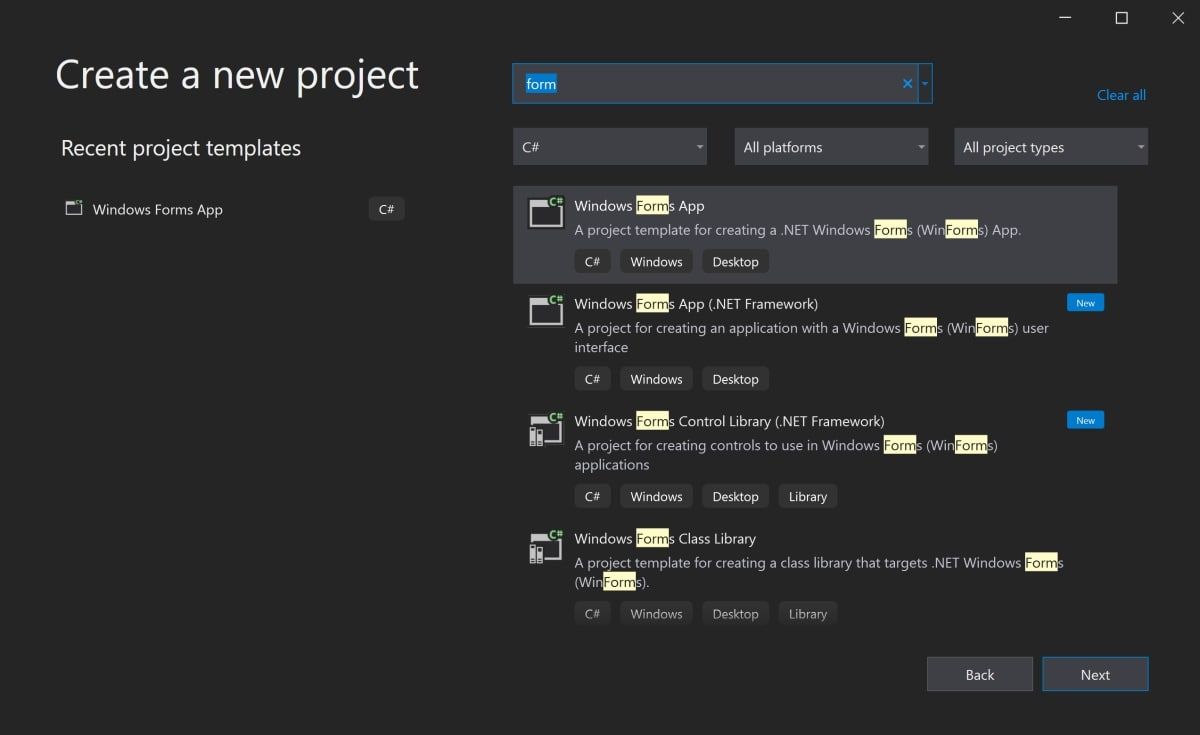
- Open Visual Studio and select Create a New Project.
- Visual Studio will provide you with a list of project templates you can choose from.
- To create a Windows Forms Application, search for Windows Form App and select it from the list of templates. Once this is selected, click on Next.

If the Windows Form App option is not available on the list, modify your installed version of Visual Studio. In Visual Studio Installer, add the .NET desktop development workload for Desktop and Mobile, and re-launch Visual Studio.
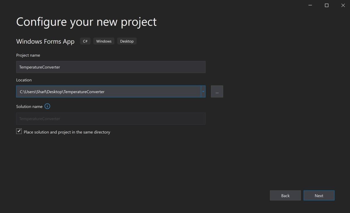
- Add a name and location for the project, and click on Next. The location is the directory where the code files will be stored.

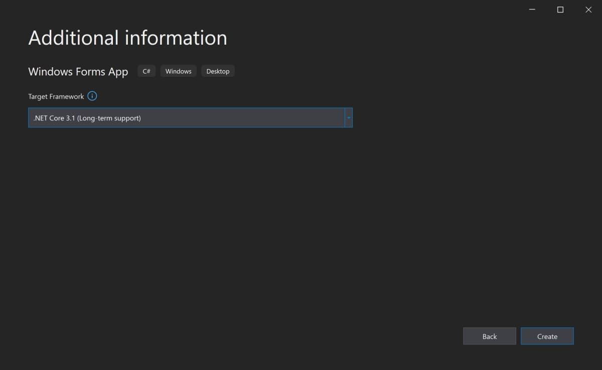
- On the next screen, keep the default selection of .NET Core 3.1.
- Click Create.

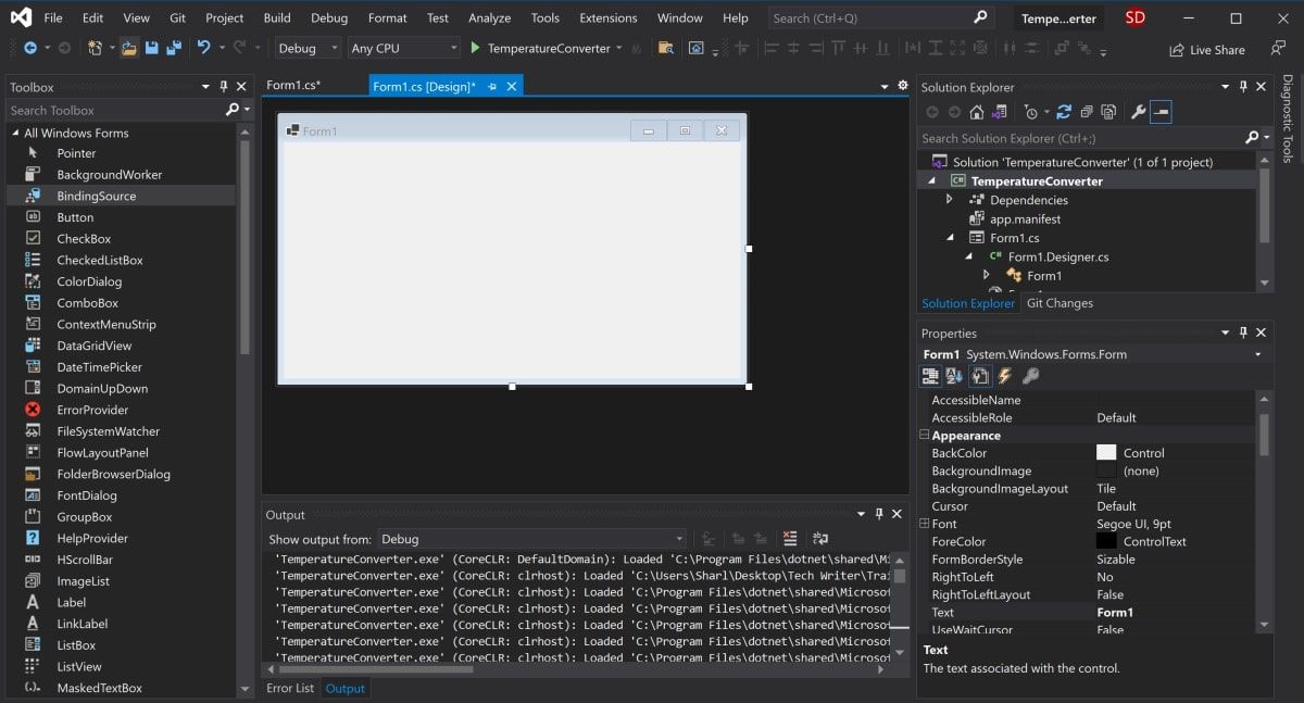
- Once Visual Studio has finished creating the project, the project will open.

How to Add Elements to the Project Canvas
The canvas is the white area located at the top-left of the screen. Click and drag the points on the bottom, right, or bottom-right of the canvas to resize it if needed.
To create the UI of the application, add widgets such as buttons or text boxes onto the canvas.
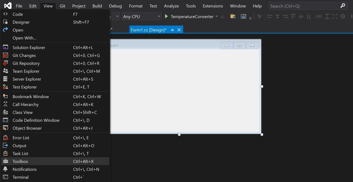
- Open the View Tab at the top of the window, and select Toolbox.

- This will add a toolbox to the left side of the application. Select the pin icon in the top-right of the toolbox to pin it there permanently.
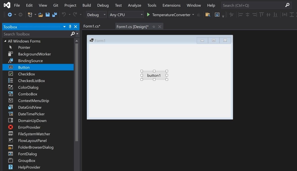
- This is where you can drag any widget from the toolbox onto the canvas. Highlight a button from the toolbox, and drag it onto the canvas.

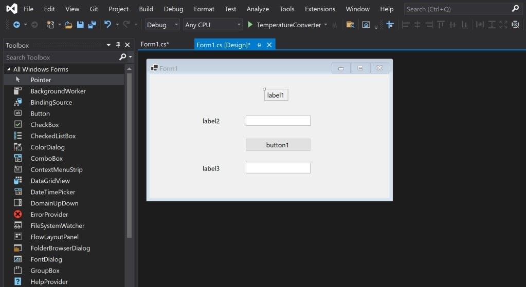
- Drag two more text boxes onto the canvas, along with three labels (two labels for each text box, and one label for the title at the top of the application).

- Every widget on the canvas has properties associated with them. Highlight a widget to display the Properties window in the bottom-right of Visual Studio, which lists all the properties that widget has. These properties can include the text, name, font size, border, or alignment of the highlighted widget.
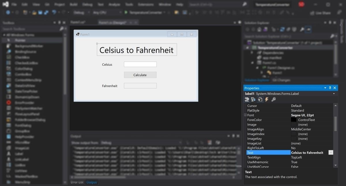
- At the moment, the text on these widgets still say label1, label2, or button1. Select the label1 widget and edit the Text property in the properties window to say «Celsius to Fahrenheit». Change the font size to be 22pt.

- Similarly, edit the properties of the other widgets on the canvas to be the following:
Widget
Property
New Value
label2
Text
Celsius
label3
Text
Fahrenheit
button
Text
Calculate
Fahrenheit text box
ReadOnly
True
How to Handle Events and Write Code in the Code-Behind
Widgets on the canvas can be tied to events. Events can include things like clicking on a button, changing the text inside a text box, or selecting a particular radio button. When these events happen, it can cause a section of code in the Code-Behind to trigger.
C# is the language used when creating Windows Forms. If you haven’t already used C#, there are many practical reasons to learn C# programming.
For this particular application, add an event to the Calculate button, to trigger a section of code to run when this button is pressed.
- Double-click the Calculate button to automatically open Form1.cs with a new Event method:
private void calculateButton_Click(object sender, EventArgs e) - This is where you will add the code that will perform the Celsius to Fahrenheit calculation, and display the result in the Fahrenheit text box. To do this, you need to be able to read the value from the Celsius text box, and modify the Fahrenheit text box to display the result.
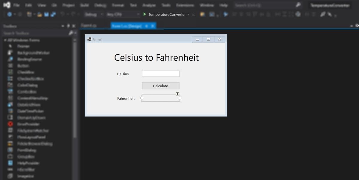
- Go back to the canvas, and re-edit the properties as shown before. This time, edit the Name property for both the Celsius and Fahrenheit text boxes. These names can be used to reference the text boxes in the code.
Widget
Property
New Value
Celsius Text Box
Name
celsiusTextBox
Fahrenheit Text Box
Name
fahrenheitTextBox
- Go back to the calculateButton_Click function in Form1.cs.
- Now, the Celsius text box can be referred to in the code using the name «celsiusTextBox». The Celsius value the user entered is stored in its Text property. However, since it’s a string, parse this into a double in order to include it in the future Fahrenheit calculations.
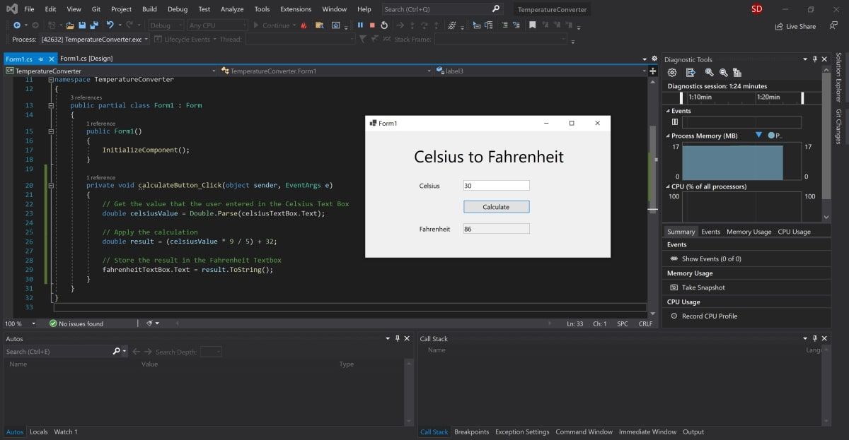
 private void calculateButton_Click(object sender, EventArgs e)
{
    // Get the value that the user entered in the Celsius Text Box
   double celsiusValue = Double.Parse(celsiusTextBox.Text);
} - The celsiusValue variable now stores the value that the user entered in the Celsius Text Box. The formula for converting Celsius to Fahrenheit is (celsiusValue * 9 / 5) + 32. Therefore, the result can now be calculated and stored in the Fahrenheit Text Box.
private void calculateButton_Click(object sender, EventArgs e)
{
// Get the value that the user entered in the Celsius Text Box
double celsiusValue = Double.Parse(celsiusTextBox.Text);// Apply the calculation
double result = (celsiusValue * 9 / 5) + 32;// Store the result in the Fahrenheit Textbox
fahrenheitTextBox.Text = result.ToString();
}
How to Run and Debug the Windows Forms Program
Running the Windows Forms Program in Visual Studio
Now that the UI and code logic is set up, run the program to see it working.
- To run the program, select the green arrow at the top of the toolbar in Visual Studio.

- Once the project has loaded, add a value into the Celsius text box and press the Calculate button. This will add the result into the Fahrenheit text box.

- If the program is blurry at runtime, it is likely your application is not DPI aware. This can cause scaling and resolution issues, so this will need to be enabled. You can also read more about configuring display scaling on Windows 10 for High-DPI monitors.
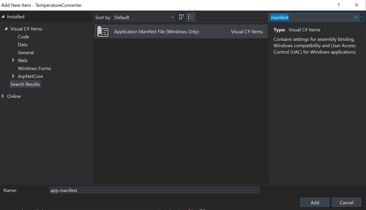
- Right-click on the TemperatureConverter Project in the Solutions Explorer. Select Add, then select New Item.
- Search for the Application Manifest File, and click Add.

- Copy the following code into the new app.manifest file, as a child of the assembly tag (if the code is already generated, just un-comment it).
 <application xmlns="urn:schemas-microsoft-com:asm.v3">
 <windowsSettings>
   <dpiAware xmlns="http://schemas.microsoft.com/SMI/2005/WindowsSettings">true</dpiAware>
   <longPathAware xmlns="http://schemas.microsoft.com/SMI/2016/WindowsSettings">true</longPathAware>
 </windowsSettings>
</application> - For this change to take effect, re-run the program. Select the red stop button at the top of the toolbar, then select the green play button again.
Debugging the Windows Forms Program
You may want to debug the program if the logic of your Windows Forms application is not working as expected.
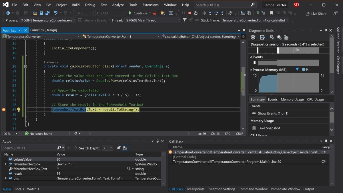
- Navigate back to the calculateButton_Click function in Form1.cs and click anywhere on the gray bar in the far-left of the screen. This will add a breakpoint, which is indicated by a red circle.
- Press the «Calculate» button again to trigger this method to execute. The program will pause when it hits the breakpoint to show all the values stored in the variables at that point.
- To continue the program, click the green Continue arrow at the top of the toolbar.

Running the Program Using an Executable File
If you don’t want to run your program through Visual Studio, use the standalone executable file for the program. This is automatically generated.
- Navigate to the executable file, which can be found here:
<your-project-folder>/bin/Debug/netcoreapp3.1/TemperatureConverter.exe - Click on the executable file to directly run the program.
Adding More to Your Windows Form
Hopefully you now have a basic understanding of the basic structure of a Windows Form Application. You can continue exploring additional Windows Forms features by experimenting with new widgets, and taking a deeper dive into the other various events that can be handled.
Once you are more familiar with Windows Forms, you can start creating more complex applications. You can also explore many of the other ways you can create applications on Windows desktop.
Начало работы. Первое приложение
Последнее обновление: 12.11.2017
Итак, начнем работу с Universal Windows Platform и создадим первый проект. Для этого откроем Visual Studio 2017 и в меню выберем пункт
File->New->Project…. Перед нами откроется окно создания нового проекта:
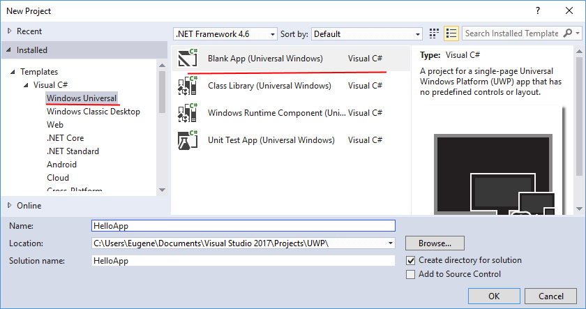
В этом окне нам надо выбрать для языка C# выбрать шаблон Blank App (Universal Windows).
Внизу окна установим путь к проекту и дадим имя проекта, например, HelloApp. И нажем на кнопку OK.
После этого нам отображается с выбором тех версий SDK, на которые будет ориентировано приложение:
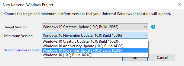
Как правило, эти версии отражают глобальные обновления ОС Windows, например, Creators Update, Anniversary Update и т.д. В качестве опции
Target Version (целевой среды приложения) рекомендуется устанавливать последнюю доступную версию SDK, которая обычно уже установлена по умолчанию.
При выборе минимальной версии следует учитывать, что выбранное значение задает минимальную версию платформы UWP, с которой проект может работать.
Оставим данные опции по умолчанию и нажмем на OK. И Visual Studio создает новый проект:
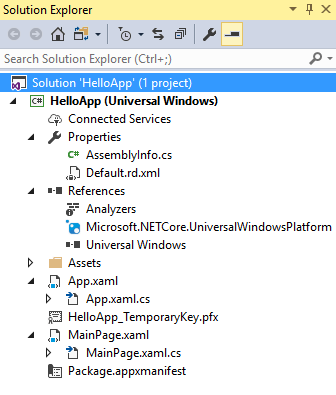
Рассмотрим все узлы, из которых состоит проект:
-
AssemblyInfo.cs: файл кода на c#, который устанавливает информацию о сборке приложения
-
Default.rd.xml: файл, который содержит директивы .NET Native — технологии, которая позволяет компилировать код C# в машинный код
-
References: стандартный узел с подключенными библиотеками
-
Assets: предназначен для хранения различных ресурсов приложения. По умолчанию здесь несколько файлов изображений
-
App.xaml и App.xaml.cs: главный файл приложения с кодом XAML и связанный с ним файл кода C#. Они устанавливают
некоторую общую логику, общие ресурсы для всего приложения -
HelloApp_TemporaryKey.pfx: временный ключ, которым подписываются приложения во время запуска на локальном компьютере разработчика
-
MainPage.xaml и MainPage.xaml.cs: файлы главной страницы приложения — графическое представление в виде кода XAML и логика в виде
кода C# -
Package.appxmanifest: файл манифеста, устаналивающий различные настройки приложения
Теперь сделаем простейшее приложение. Визуально приложение UWP представлено через страницы — отдельные объекты Page. По умолчанию в проекте есть
только одна страница — MainPage. Код этой страницы и определяет то, что мы увидим на экране при запуске приложения. И теперь немного изменим ее.
Итак, откроем файл MainPage.xaml:
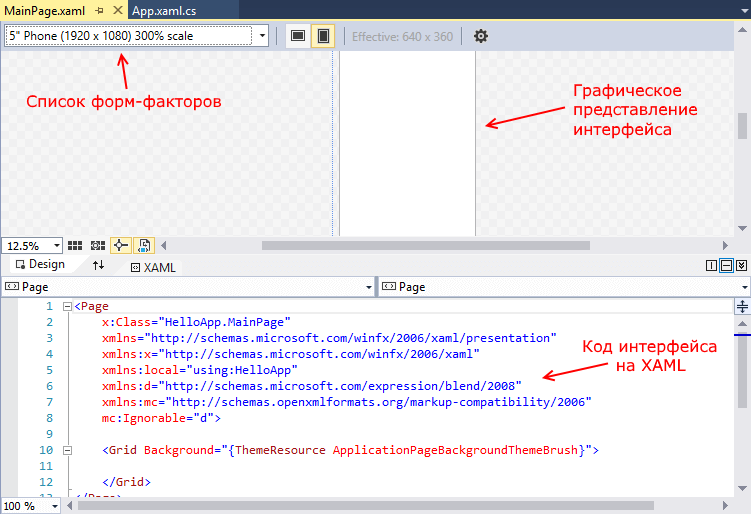
Снизу у нас окажется разметка на языке XAML — языке для декларативного определения графического интерфейса, а сверху визуальное представления кода XAML
в виде прямоугольника, представляющего окно приложения.
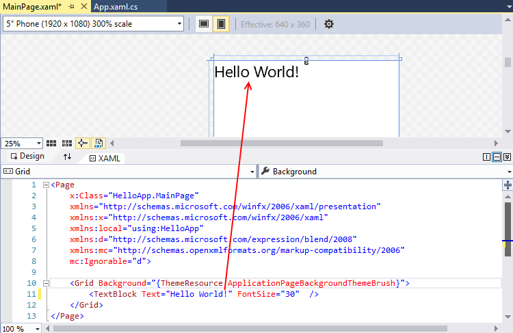
Внесем небольшие изменения. Изменим код XAML на следующий:
<Page
    x:Class="HelloApp.MainPage"
    xmlns="http://schemas.microsoft.com/winfx/2006/xaml/presentation"
    xmlns:x="http://schemas.microsoft.com/winfx/2006/xaml"
    xmlns:local="using:HelloApp"
    xmlns:d="http://schemas.microsoft.com/expression/blend/2008"
    xmlns:mc="http://schemas.openxmlformats.org/markup-compatibility/2006"
    mc:Ignorable="d">

    <Grid Background="{ThemeResource ApplicationPageBackgroundThemeBrush}">
        <TextBlock Text="Hello World!" FontSize="30" />
    </Grid>
</Page>
Суть сделанных нами изменений состоит в том, что мы добавили элемент <TextBlock Text="Hello World!" FontSize="30" /> — обычную текстовую метку с надписью
«Hello World!». И чтобы сделать текст крупным, у текстовой метки устанавливается шрифт высотой в 30 единиц. После изменения также должны произойти автоматические изменения в визуальном представлении:
Теперь запустим проект на выполнение, нажав на F5. И у нас отобразиться такое вот окошко, представляющее MainPage:
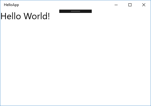
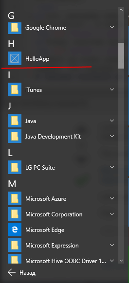
При запуске это приложение устанавливается на рабочий компьютер разработчика, и мы можем найти его в меню Пуск и оттуда запускать:
Запуск на Windows 10 Mobile
Также мы можем развернуть и простестировать приложение на мобильном устройстве под управлением Windows 10 Mobile. Но для этого надо подключить мобильное устройство
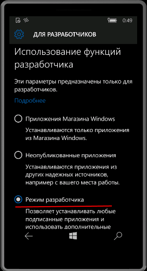
к компьютеру с помощью кабеля USB, а на самом смартфоне
установить режим разработчика на телефоне можно, перейдя в Параметры ->
Обновление и безопасность -> Для разработчиков и выбрав пункт «Режим разработчика»: