Время на прочтение
6 мин
Количество просмотров 22K
Доброго времени суток!
В данной статье я опишу создания своих элементов для C# Windows Form.
Для примера буду создавать таблицу со всем функционалом DataGridView. Позже перейдем на свои элементы. Создание первого элемента разобьем на несколько уроков. В данном уроке произведем от рисовку таблицы, а также: создание столбцов, строк, ячеек.
Для написания будем использовать .Net FrameWork 4.7.x, среда разработки Visual Studio 2019.
В первую очередь создадим обычный проект Windows Form. Думаю не нужно это показывать. А уже потом создаем проект «Библиотека элементов управления Windows Form»(Назовем его CustomControl).
Далее у нас будет создан файл UserControl.cs. Удаляем его и создаем обычный класс TableCustoms.cs.Наш класс будет наследоваться от класса Control.
Далее в этом же файле создадим еще несколько классов, а именно:Column,Row,Cell. Рассмотрим каждый по отдельности. Начнем с Column:
    [Serializable]
    public class Column
    {
        public string Name { get; set; } = "NameColumn";//Наименование Столбца
        public string Caption { get; set; } = "CaptionColumn";//Текст заголовка
        public int Width { get; set; } = 100;//Стандартная ширина
        public Color Back { get; set; } = Color.White;//Цвет фона

        public Column()
        {

        }
    }
Класс Row:
    [Serializable]
    public class Row
    {
        public int Heigth { get; set; } = 20;// Высота строки
        public List<Cell> Cells { get; set; } = new List<Cell>();//список ячеек
        public Row()
        {

        }
        public Row(List<Cell> cells)
        {
            Cells = cells;
        }

    }
Класс Cell(Для поддержки копирования добавляем интерфейс ICloneable):
    [Serializable]
    public class Cell : ICloneable
    {
        public object Value { get; set; } = null;//значение ячейки
        public Cell()
        {
        }
        public object Clone()
        {
            return MemberwiseClone();
        }
    }
Теперь настроим наш основной класс TableCustoms:
   public class TableCustoms : Control
    {
        #region Перемененные
        public ObservableCollection<Column> Columns { get; set; } = new ObservableCollection<Column>();//Список столбцов таблицы
        private ObservableCollection<Row> rows = new ObservableCollection<Row>();//Список строк
        private int countRow = 0;//количество строк
        #endregion
        #region Свойства
        public int CountRow // гетер и сетер при увеличении переменной на N раз
        {
            get { return countRow; }
            set
            {
                //При увеличении добавляем
                if (value > countRow)
                {
                    int iteration = value - countRow;
                    for (int i = 0; i < iteration; i++)
                    {
                        rows.Add(new Row());
                    }
                }
                //при уменьшении удаляем с конца
                if (value < countRow)
                {
                    int iteration = countRow - value;
                    for (int i = 0; i < iteration; i++)
                    {
                        rows.Remove(rows[rows.Count - 1]);
                    }
                }

                countRow = value;
            }
        }
        //гетер и сетер для списка строк, будет использоваться позже
        public ObservableCollection<Row> Rows
        {
            get { return rows; }
            set { }
        }

        public int ColumnHeaderHeigth { get; set; } = 20;//высота шапки таблицы
        public int RowHeaderWidth { get; set; } = 20;//высота заголовков строк
        public Color ColumnHeaderBack { get; set; } = SystemColors.Control;//Основной цвет фона заголовков таблицы
        public Color BorderColor { get; set; } = Color.Black;//Стандартный цвет границ таблицы
        public bool NumerableRows { get; set; } = false;//Флаг автоматической нумерации
        #endregion
        //Метода изменения столбцов, будет использоваться в следующем уроке
        private void EditColumn()
        {

        }
        //Метод изменения строк
        private void EditRows()
        {
            if (countRow < rows.Count)//Увеличение количества строк
            {
                rows[rows.Count - 1].Cells = CreatCells(Columns.Count);//Добавление пустых ячеек в строку
                countRow++;
            }
            if (CountRow > rows.Count)//уменьшение количества строк
            {
                countRow--;
            }

        }
        //метод создания N количества ячеек
        private List<Cell> CreatCells(int Count)
        {
            // return Enumerable.Repeat(new Cell(), Count).ToList();
            List<Cell> result = new List<Cell>();
            for (int i = 0; i < Count; i++)
            {
                result.Add(new Cell());
            }
            return result;
        }
        public TableCustoms()
        {
            rows.CollectionChanged += (e, v) => EditRows();//проверка изменения списка
            Columns.CollectionChanged += (e, v) => EditColumn();//проверка изменения списка
            BackColor = SystemColors.AppWorkspace;//Стандартный фон
            PanelTable panelTable = new PanelTable(this);//Создание основной панели
            panelTable.Dock = DockStyle.Fill;//Растягиваем основную панель по Control
            Controls.Add(panelTable);//Добавление панели на Control
        }
    }
Для того, чтобы у нас были полосы прокрутки нужно использовать ScrollableControl, поэтому создадим класс PanelTable наследуем ScrollableControl и помещаем его на Control(в следующем уроке объясню почему создаем два разных контрола, а не используем сразу ScrollableControl):
 internal class PanelTable : ScrollableControl//Control со ScrolLbar
        {
            private TableCustoms BParent;//переменная основного класса, для работы с свойствами
            public PanelTable(TableCustoms bParent)
            {
                HScroll = true;//Отображение ползунка по горизонтали
                VScroll = true;//Отображение ползунка по вертикали
                AutoScroll = true;//Автоматическое появление полос прокрутки
                BParent = bParent;
            }
            //переопределение метода
            protected override void OnPaint(PaintEventArgs e)
            {
                Matrix m = new Matrix();
                m.Translate(this.AutoScrollPosition.X, this.AutoScrollPosition.Y, MatrixOrder.Append);
                e.Graphics.Transform = m;
                Graphics graf = e.Graphics;
                int maxWidth = 0;//Высота AutoScrollMinSize
                int maxHeight = 0;//Ширина AutoScrollMinSize
                                  //расчитываем ширину
                foreach (Column item in BParent.Columns)
                {
                    maxWidth += item.Width;
                }
                //расчитываем высоту
                foreach (Row item in BParent.Rows)
                {
                    maxHeight += item.Heigth;
                }
                AutoScrollMinSize = new Size(maxWidth + 100, maxHeight + 100);//назначаем AutoScrollMinSize относительно этого будут появляться полосы прокрутки
                graf.Clear(BParent.BackColor);
                DrawHeaderColumns(graf);//Отрисовка заголовков столбцов таблицы
                DrawHeaderRows(graf);//Отрисовка заголовков строк таблицы
                DrawCells(graf);//Отрисовка ячеек
                base.OnPaint(e);
            }
            /// <summary>
            /// Отрисока заголовков столбцов
            /// </summary>
            /// <param name="graf"></param>
            private void DrawHeaderColumns(Graphics graf)
            {
                int x = 2;
                Rectangle rect;
                rect = new Rectangle(x, 1, BParent.RowHeaderWidth, BParent.ColumnHeaderHeigth);
                graf.DrawRectangle(new Pen(BParent.BorderColor), rect);
                graf.FillRectangle(new SolidBrush(BParent.ColumnHeaderBack), rect);
                x += BParent.RowHeaderWidth + 1;
                foreach (Column item in BParent.Columns)
                {
                    rect = new Rectangle(x, 1, item.Width, BParent.ColumnHeaderHeigth);
                    graf.DrawRectangle(new Pen(BParent.BorderColor), rect);
                    graf.FillRectangle(new SolidBrush(BParent.ColumnHeaderBack), rect);
                    if (item.Caption.Length != 0)
                    {
                        StringFormat sf = new StringFormat();
                        sf.Alignment = StringAlignment.Center;
                        sf.LineAlignment = StringAlignment.Center;
                        graf.DrawString(item.Caption, new Font("Times", 9), Brushes.Black, rect, sf);
                    }
                    x += item.Width + 1;
                }
            }
            //Отрисовка заголовков строк
            private void DrawHeaderRows(Graphics graf)
            {
                int y = 1;
                int i = 0;
                Rectangle rect;
                y += BParent.RowHeaderWidth + 1;
                foreach (Row item in BParent.Rows)
                {
                    rect = new Rectangle(2, y, BParent.RowHeaderWidth, item.Heigth);
                    graf.DrawRectangle(new Pen(BParent.BorderColor), rect);
                    graf.FillRectangle(new SolidBrush(BParent.ColumnHeaderBack), rect);
                    if (BParent.NumerableRows)
                    {
                        StringFormat sf = new StringFormat();
                        sf.Alignment = StringAlignment.Center;
                        sf.LineAlignment = StringAlignment.Center;
                        graf.DrawString(i.ToString(), new Font("Times", 9), Brushes.Black, rect, sf);
                    }
                    i++;
                    y += item.Heigth + 1;
                }
            }
            //отрисовка ячеек
            private void DrawCells(Graphics graf)
            {

                int x = 2 + BParent.RowHeaderWidth + 1;
                int y = 2 + BParent.ColumnHeaderHeigth;
                Rectangle rect;
                int i = 0;
                foreach (Row itemRow in BParent.Rows)
                {
                    foreach (Column itemColumn in BParent.Columns)
                    {
                        rect = new Rectangle(x, y, itemColumn.Width, itemRow.Heigth);
                        graf.DrawRectangle(new Pen(BParent.BorderColor), rect);
                        graf.FillRectangle(new SolidBrush(Color.White), rect);
                        if (itemRow.Cells[i].Value != null)
                        {
                            StringFormat sf = new StringFormat();
                            sf.Alignment = StringAlignment.Center;
                            sf.LineAlignment = StringAlignment.Center;
                            graf.DrawString(itemRow.Cells[i].Value.ToString(), new Font("Times", 9), Brushes.Black, rect, sf);
                        }
                        x += itemColumn.Width + 1;
                        i++;
                    }
                    i = 0;
                    y += itemRow.Heigth + 1;
                    x = 2 + BParent.RowHeaderWidth + 1;
                }
            }
        }
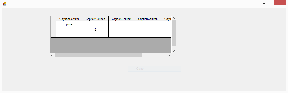
После этого «Пересобираем проект» элемента и добавляем элемент на форму(в основном проекте):

Теперь проверим некоторые методы нашего элемента:
  public partial class Form1 : Form
    {
        public Form1()
        {
            InitializeComponent();
             tableCustoms1.Rows.Add(new Row());//добавление строки
             tableCustoms1.Rows.Add(new Row());
             tableCustoms1.Rows[0].Cells[0].Value = "1";//Изменение значения ячейки
             tableCustoms1.Rows[1].Cells[1].Value = "2";
            tableCustoms1.CountRow++;//увеличение числа строк
            tableCustoms1.Rows[0].Cells[0].Value = "привет";
        }
    }
Запускаем наш проект:
Custom controls are specialized controls in .NET derived from Control class. In this article, we explain the step by step process of creating a custom control in C# WinForms application.
Table of Contents
- Custom Control in C# Winforms
-
- Usercontrols
- Inherited controls
- Owner-drawn controls
- C# Custom Button Control
-
- How to Use the Custom Control in C#
- Summary
Custom Control in C# Winforms
We can have the following types of Custom Controls in C# or VB.NET
Usercontrols
Usercotrols are the simpler form of custom controls which are derived from the class
System.Windows.Forms.UserControl. In most cases, UserControls form a compositional approach in which multiple controls are grouped together in a single user interface element.
Example, Login control with username and password text boxes.
Inherited controls
Inherited controls are an extension of an existing control. First you find the preexisting.NET control that most closely matches your desired functionality. Then you inherit that class with extended features such as additional behaviours and properties.
Example of Inherited controls are Cutom button control(explained below) , ExtendedRichTextBox Control, etc.
Owner-drawn controls
Owner-drawn controls normally draw user interfaces from beginning using GDI+ routines. They inherit the System.Windows.Forms.Control class. Because they are built up from scratch the Owner-drawn controls need the most effort to make , but they can offer the most adaptable user interface.
Extender providers
These widgets are a fantastic method of creating an adaptable user interface because they extend the functionality of existing controls on a form.
C# Custom Button Control
In this post, we are going to see how can we creating custom controls. As an example, we will create a custom button control. The example is a Specialized C# button control which changes its look and feels when mouse hovers over it.
If not active the button will appear as shown in the below screenshot.

When you hover mouse over the button(focus on the button) the look and feel of the button changes as below and the cursor type also change to hand type.

Now let’s see the steps involved in creating this special button control.
- Launch Visual Studio and Create a Windows control library project Name it as SpecialButton. By default, it will create a Usercontrol class.Delete the same since we are not creating a user control here.
- Now right click on the project and Select Add New item.Select Custom Control from the list.Name the control as SpecialButton(you can choose whatever name you want).
- Go to source code window and add the following code.
using System;
using System.Drawing;
using System.Windows.Forms;

namespace SpecialButton
{
     public partial class SpecialButton : Button
     {
        public SpecialButton()
        {
             InitializeComponent();

             //Set default property values for the button during startup
             SetNormalValues();
         }

       /// <summary>
       /// To Set button properties when not active.i.e when button not in focus.
       /// </summary>

      private void SetNormalValues()
      {
           this.Font = new Font("Verdana", 8F, FontStyle.Bold);
           this.BackColor = Color.Gray;
           this.ForeColor = Color.White;
           this.Margin = new Padding(4, 1, 4, 1);
           this.Padding = new Padding(4);
           this.MinimumSize = new Size(150, 35);
           this.Cursor = Cursors.Arrow;
      }

      /// <summary>
      /// Set attributes to highlight button when it is under focus/active.
      /// Change the cursor also as Hand type
      /// </summary>

      private void SetValuesOnFocus()
      {
          //Increase the font size and colors on focus
          this.Font = new Font("Verdana", 10F, FontStyle.Bold);

          this.BackColor = Color.Green;
          this.ForeColor = Color.White;

          //Set the cursor to Hand type
          this.Cursor = Cursors.Hand;
      }

     /// <summary>
     /// Default handler.Nothing to do here since we don't need to repaint the button.
     /// </summary>
     /// <param name="pe"></param>

         protected override void OnPaint(PaintEventArgs pe)
         {
             base.OnPaint(pe);
         }

      /// <summary>
      /// Event handler which call SetValuesOnFocus() method to give apecial
      /// effect to button while active
      /// </summary>
      /// <param name="e"></param>

          protected override void OnMouseHover(EventArgs e)
          {
               base.OnMouseHover(e);
               SetValuesOnFocus();
          }

       /// <summary>
       /// Event handler which call SetNormalValues() method to set back the button
       /// to normal state
       /// </summary>
       /// <param name="e"></param>

         protected override void OnMouseLeave(EventArgs e)
         {
             base.OnMouseLeave(e);
             SetNormalValues();
          }
      }
}
- Build the solution successfully.Your custom control library is ready now. Feel free to customize the code if you want more affect.For example the above code works on mouse events only. Forgetting it work on tab key you need to use events like,
protected override void OnEnter(EventArgs e)
{
    base.OnEnter(e);
    SetValuesOnFocus();
}

protected override void OnLeave(EventArgs e)
{
    base.OnLeave(e);
    SetNormalValues();
}
For the time being, we will concentrate on the above-mentioned code with mouse events to understand the basics of creating custom control in C#.
How to Use the Custom Control in C#
- Create a normal windows form project. Reference the above created SpecialButton Control library dll.
- You can see the SpecialButton displayed in the toolbar top left if the project inside the same solution as SpecialButton control library.
- If the control library is an independent solution and Test project is part of another solution then you need to Add the control to the toolbox.For that go to the bottom of ToolBox and Right click. Select Choose Items from the context menu.Now Go to .NET Framework Components tab.Click the Browse button and choose your library(SpecialButton) from the bin folder.
- Now you can see the custom control listed in the bottom of tool box as below.

- Drag & drop the SpecialButton to your form and set the button name and Text.I named the button as btnSpecialButton and gave caption Test as Test Button. In the button click event write the following code to ensure button work as expected.
private void btnSpecialButton_Click(object sender, EventArgs e)
{
     MessageBox.Show("C# Custom button click test");
}
Run your WinForm project Test the button.On mouse enter t the button you get the highlighted effect with Hand cursor.
On Click, you get the message box.
On mouse leave the button go back to default state.
Summary
This post covered the steps to create custom controls in C# WinForms.The code logic is same for Creating Custom controls in VB.NET also.Hope this article was helpful for you.If you have any queries or feedback to share about Creating Custom controls in .NET, write it in the comments section below.
Related Searches: Make Custom control in C# and VB.NET, Create custom control in C# and VB.NET
You may also be interested to read Create Usercontrol in C# WinForms applications
Reader Interactions
Introduction
Simple Custom Controls
Custom controls are control that are created by user when Windows Forms controls do not fulfill their application requirements. Simple custom controls can be created by inheriting the Control class, UserControl class, or any Windows Forms controls. The developer should write the code for the custom control in the OnPaint event of the control. After writing the code, it should be saved with the .cs extension. The code can be complied into an assembly and saved into the application’s directly by executing the following command:
Syntax
csc /t:library/out:<path to your application;s directory>/<name of the assembly that contains the custom control class> /r:System.dll
/r: System.Windows.Form.dll /r: System.Drawing.dll <name of the custom control class file>
Where,
- /t:library, Instructs the compiler that the assembly that is being created is a library and it is cannot be executed.
- /out : Specifies the name and path of the assembly file that contains the custom control.
- /r: Specifies the names of all the assemblies that are used by the code.
Control Class
The Control class includes functionalities to handle user input, define position and size of controls, and so on. The control class can be inherited by other classes to display information to the user. The properties of Control class.
- Bounds
Specifies or retrieves the size and location of the specified control with respect to its parent control. - CanFocus
Retrieves a value that indicates whether the specified control can receive focus. - CanSelect
Retrieves a value that indicates whether the specified control can be selected. - Created
Retrieved a value that indicates whether the specified the specified control has been created.
Dock
Specifies or retrieves the control borders, which are docked to its parent control. It also identifies the way a control is resized with its parent.
Left
Retrieves the distance between the left edge of specified control and the left edge of the container’s client area. - Right
Retrieves the distance between the right edge of specified control and the left edge of the container’s client area. - TabIndex
Specifies or retrieves the tab order of the specified control within a container.
Table below the list of methods of control class.
| Method | Description |
| Contains | specifies control is a child of the control |
| CreateControl | Forcibly creates a control along with its handle and child controls. |
| CreateGraphics | Creates a graphic for the specified control. |
| GetNextControl | It retrieves the next control according to the specified tab order of child controls. |
| GetPreferredSize | It retrieves the size of the rectangular area. |
| Hide | Hides the specified control from the user. |
Below are the lists of events of Control class.
| Event | Description |
| ControlAdded | Occurs when a new control is added to a collection of controls. |
| ControlRemoved | Occurs when a specified control is removed from a collection of controls. |
| Validated | Occurs when the validation process of the specified control is complete. |
Code below creates a rectangular custom control and changes its appearance when the control is validated.
public partial class CustomControl: Control {
    Graphics graphics;
    protected override void OnPaint(PaintEventArgs pe) {
        this.Bounds = new Rectangle(15, 15, 30, 15);
        if (this.CanFocus) {
            this.Focus();
        }
        this.Dock = DockStyle.None;
        graphics = this.CreateGraphics();
        graphics.FillRectangle / (Brushes.CornflowerBlue, ClientRectangle);
    }
    protected override void OnValidated(EventsArgs e) {
        graphics.FillRectangle(Brushes.MediumOrchid, ClientRectangle);
        graphics.DrawRectangle(new Pen(Color.Black, ClientRectangle);
    }
}
In this code, the custom control is created by inheriting the Control class. When the OnPaint() method is invoked, the Bounds property is used to set a rectangular region. This is done by invoking the constructor of the Rectangular class, which takes the x and y coordinates, width and height as the parameters. The CanFocus property is used to check whether the control can receive focus. By default, it returns true and the focus() method is used to focus the control. The dock style for the control is set to None, which means that control cannot be dragged to some other location on the form. The graphics object Brush, is used to create the custom control within the specified rectangular bounds. When the validations are successfully made to the control, the OnValidated() method is invoked. This event changes the appearance of the control by changing its back color and border color.
The following code demonstrates how to override the Text and BackColor properties of the Control class. This is useful in setting the default values of the properties when the custom control appears on the form.
public partial class CustomLabel: Control {
    private string labelText;
    private Color bgColor = Color.darkBlue;
    public override string Text {
        get {
            return labelText;
        }
        set {
            labelText = value;
            Invalidate();
        }
    }
    public override Color BackColor {
        get {
            return bgColor;
        }
        set {
            bgColor = value;
        }
    }
    protected override void OnPaint(PaintEventArgs pe) {
        Graphics graphics = this.CreateGraphics();
        graphics.FillRectangle(new SolidBrush(bgColor), ClientRectangle);
        graphics.DrawString(labelText, new Font(“Times”, 12), Brushes.Wheat, new Point(5, 5));
    }
}
The Text property of the Control class is overridden. The BackColor property is also overridden to set the default color as dark blue. When the custom control is added to the form, the control appears with dark blue as the background color and customLabel as the default text. This text and background color appear on the label due to the Invalidate() method, which in turn, calls the OnPaint() method. This method redraws the control within the given client area along with the specified text and background color.
UserControl Class
The UserControl class allows the user to create controls that can be used in many places within an application of across multiple applications.
Table shows the properties of UserControl class
| Property | Description |
| AutoSizeMode | Specifies or retrieves the way a control will resize itself. |
| AutoValidate | Specifies or retrieved the way a control performs validation when the focus is switched to another control |
| HorizontalScroll | Retrieves the characteristics of the horizontal scroll bar. |
| VerticalScroll | Retrieves the characteristics of the vertical scroll bar. |
Table below the methods of UserControl class.
| Method | Description |
| PerformAutoScale | Performs automatic scaling of the specified container control and its child controls. |
| ScrollControlView | Scrolls the specified control into view. |
Table shows the events of UserControl class.
| Event | Description |
| AutoValidateChanged | It occurs when the value of AutoValidate property is changed. |
| Load | Before the specified control becomes visible for the first time. |
Code below shows how to create custom scroll bars using the UserControl class.
public partial class ScrollControl: UserControl {
    protected override void OnPaint(PaintEventArgs e) {
        this,
        VerticalScroll,
        Visible = true;
        this.HorizontalScroll.Visible = true;
        this.PerformAutoScale();
    }
    private void ScrollControl_Load(object sender, EventArgs e) {
        this.VericalScroll.Minimum = 0;
        this.VerticalScroll.Maximum = 100;
        this.HorizontalScroll.Minimum = 0;
        this.HorizontalScrollMaximum = 60;
    }
}
The OnPaint() method is invoked to set the vertical and horizontal scroll bars. This is done using the VerticalScroll and HorizontalScroll properties of the UserControl class. The PerformAutoScale() method automatically scales the control and its container control. When the created custom control is loaded, the Load event is raised. When this event is raised, the Minimum and Maximum properties sets the minimum and maximum limits for both the scroll bars.
Control Type Recommendations
Windows Forms provide the user with a variety of options while working with controls. The user can either use the Windows Forms controls or create a new control. But, sometimes, the user might get confused about the type of control to be used in the application. The difference between various types of controls from which the user can inherit are listed as follows:
Inheriting Windows Forms Controls
Inheriting Windows Forms controls allows the user to implement the functionalities of the inherited control. The user can also extend the functionalities of the inherited control. The user can inherit from the Windows Forms control if the inheriting control fulfills most of the application’s requirements.
Inheriting the Control Class
The user can inherit from the Control class while customizing the appearance of the control. Also, inheriting the control class allows the user to implement the functionalities that are not provided by the standard controls.
Inheriting the UserControl Class
When the user wants to combine the functionalities of several Windows Forms controls, a user can create a composite control by inheriting the UserControl class.
Property- Changed Events
Windows Forms allows the user to send notifications when the value of the property is changed. The user can send notifications by defining an event and then a method that raises the event. The event name is the name of the property by appending the word, Changed, to the name of the property. For example, if the name of the property is BackColor, the user can define an event named BackColorChanged and the event-handler method named OnBackColorChanged.
Event handlers can be created to respond to property- change events. This allows developers to define various actions that can take place when a property of the control is changed.
Code below creates a custom TextBox control and raises an event when a value in the control is changed
public partial class TxtPrincipal: TextBox {
    int years;
    float rate;
    double principal;
    double interest;
    protected override void OnTextChanged(EventArgs e) {
        years = 10;
        rate = 8.5 F;
        principal = 0;
        interest = 0;
        try {
            principal = Convert.ToDouble(this.Text);
            interest = (principal * years * rate) / 100;
            this.Parent.Text = ”Interest is: ”+interest.ToString();
        } catch (Exception ex) {
            MessageBox.Show(“Enter the numeric value only.”, ”ABCDBank”, MessageBoxButtons.OK, MessageBoxIcon.Error);
            this.Focus();
        }
    }
}
In this code, a custom textbox namely, TxtPrincipal is created. The OnTextChanged event is overridden and is raised when the value in the control is changed. The code calculated the interest using the values specified in the control.
Summary
User-defined controls can be created by inheriting the control class. UserControl class, or any windows forms existing control’s class. The HorizontalScroll and VerticalScroll properties of the UserControl class can be used to define custom scroll bars. The GetImage() method of the ToolBoxBitmapAttribute class retrieves the image icon associated with the custom control. Composite controls are user controls that are created using one or more Windows Forns controls. Property-changed events allows the user to send notification whenever the value of the property is changed.
В Windows Forms пользовательские элементы управления (User Controls) позволяют создавать свой собственный, уникальный интерфейс для приложений на C#. В этой статье мы рассмотрим процесс создания нестандартного элемента управления в Windows Forms.
1. Создание новой формы.
Прежде всего, мы должны создать новую форму, на которой будет располагаться наш пользовательский элемент управления. Для этого нажмите правой кнопкой мыши на проект в Solution Explorer и выберите пункт «Add New Item».
Далее в списке шаблонов выберите значок «Windows Form». Введите имя для новой формы и нажмите «Add».
2. Создание пользовательского элемента управления.
Теперь мы можем создать пользовательский элемент управления. Для этого нажмите правой кнопкой мыши на проект в Solution Explorer и выберите пункт «Add New Item».
В списке шаблонов выберите значок «User Control». Введите имя для нового элемента и нажмите «Add».
3. Редактирование пользовательского элемента управления.
Откройте файл с пользовательским элементом управления и настройте его свойства и внешний вид согласно своим потребностям. Добавьте элементы управления, которые должны быть доступны в вашем пользовательском элементе управления.
4. Добавление пользовательского элемента управления на форму.
Перетащите пользовательский элемент управления из Solution Explorer на новую форму, которую мы создали в первом шаге.
Мы можем настроить размер и положение элемента управления, щелкнув на нем два раза, чтобы перейти в режим редактирования пользовательского элемента управления.
5. Создание свойства для пользовательского элемента управления.
Вы можете создать пользовательское свойство для вашего нового элемента управления в пользовательском классе управления. Для создания свойства, которое будет возвращать и устанавливать значение текста в пользовательском элементе управления, добавьте следующий код:
private string _textValue;
public string TextValue
{
get { return _textValue; }
set { label1.Text = value; _textValue = value; }
}
В данном примере мы создаем новое свойство «TextValue», которое возвращает и устанавливает значение строки, содержащейся в лейбле. Мы также сохраняем значение этого свойства в частном поле «_textValue», чтобы мы могли использовать его в других областях кода.
6. Использование пользовательского элемента управления.
Теперь мы можем использовать наш новый пользовательский элемент управления в приложении. Для этого нам нужно обратиться к пользовательскому элементу управления по имени и установить значение для его свойства «TextValue». Пример:
myUserControl1.TextValue = «Hello world!»;
Теперь вы знаете, как создать свой собственный пользовательский элемент управления в Windows Forms. Создание пользовательского элемента управления может занять некоторое время, но это отличный способ сделать ваше приложение уникальным и увеличить его функциональность.
Создание пользовательских элементов управления Windows Forms
Платформа .NET предлагает для разработчиков очень простой способ создания пользовательских элементов интерфейса. В отличие от (теперь уже считающихся устаревшими) элементов управления ActiveX, для элементов управления Windows Forms не требуется громоздкая инфраструктура COM или сложное управление памятью. Вместо этого разработчику нужно просто создать новый класс, получающийся из UserControl, и наполнить этот тип любыми подходящими свойствами, методами и событиями. Для иллюстрации этого процесса мы с помощью Visual Studio 2005 построим пользовательский элемент управления, назвав его CarControl.
Замечание. Как и в случае любого .NET-приложения, вы имеете возможность построить любой пользовательский элемент управления Windows Forms «вручную», используя только текстовый редактор и компилятор командной строки. Как вы вскоре убедитесь, элементы управления содержатся в компоновочных блоках *.dll, поэтому вы должны указать опцию /target:dll компилятора csc.exe.
Начните с запуска Visual Studio 2005 и выберите,для нового проекта рабочее пространство Windows Control Library, указав имя CarControlLibrary (рис 21.27).
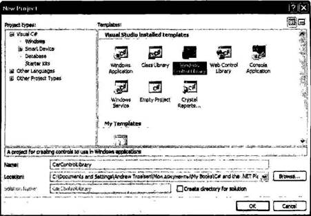
Рис. 21.27. Создание нового рабочего пространства Windows Control Library
После создания проекта переименуйте исходный C#-класс в CarControl. Как и в случае проекта Windows Application, ваш пользовательский элемент управления будет скомпонован из двух классов. Файл *.Designer.cs содержит программный код, генерируемый инструментами проектирования, а первичный парциальный класс определяет тип, получающийся из System.Windows.Forms.UserControl.
namespace CarControlLibrary {
public partial class CarControl: UserControl {
public CarControl() {
InitializeComponent();
}
}
}
Перед тем как двигаться дальше, давайте рассмотрим общую картину того, что мы хотим получить. Тип CarControl отвечает за анимацию серии точечных рисунков, которые будут изменяться в зависимости от внутреннего состояния автомобиля. Если текущая скорость автомобиля значительно ниже предельной скорости, для CarControl циклически будут отображаться три точечных рисунка, представляющие безопасное движение автомобиля. Если текущая скорость всего на 10 км/ч ниже максимальной, для CarControl используется цикл из четырех рисунков, где четвертый рисунок изображает автомобиль, медленно распадающийся на части. Наконец, если автомобиль превысит максимальную скорость, циклы CarControl будет состоять из пяти рисунков, где пятый рисунок изображает «обреченный» автомобиль.
Читайте также
Создание Web-форм и элементов управления
Создание Web-форм и элементов управления
Настала пора рассмотреть средства языков HTML и CSS, предназначенные для создания Web-форм и элементов управления, и возможности объектов Web-обозревателя и библиотеки Ext Core для работы с ними. Их довольно
Создание элементов управления
Создание элементов управления
Большинство элементов управления HTML создают посредством одинарного тега <INPUT>. Какой именно элемент управления следует создать, указывают с помощью необязательного атрибута TYPE этого тега. Некоторые элементы управления, такие как
Создание Web-форм и элементов управления
Создание Web-форм и элементов управления
Настала пора рассмотреть средства языков HTML и CSS, предназначенные для создания Web-форм и элементов управления, и возможности объектов Web- обозревателя и библиотеки Ext Core для работы с ними. Их довольно много.
Создание Web-форм
Для
Создание элементов управления
Создание элементов управления
Большинство элементов управления HTML создают посредством одинарного тега <INPUT>. Какой именно элемент управления следует создать, указывают с помощью необязательного атрибута TYPE этого тега. Некоторые элементы управления, такие как
Создание пользовательского интерфейса на основе Windows Forms
Создание пользовательского интерфейса на основе Windows Forms
Разработчики предыдущих версий Visual Basic первыми предложили концепцию связывания данных, согласно которой связанный с данными объект или элемент управления данными (data control) позволяет программистам с минимальными
Добавление новых элементов в панель элементов управления
Добавление новых элементов в панель элементов управления
Чтобы получить возможность использовать элемент управления ActiveX, выполните следующее.1. Установите программное обеспечение элемента управления на жесткий диск.Мне кажется, это имеет смысл.2. Зарегистрируйте
Инструменты проектирования Windows Forms
Инструменты проектирования Windows Forms
Windows Forms является средством создания приложений, возможности которого мы рассмотрим позже. А сейчас, чтобы продолжить рассмотрение SharpDevelop, щелкните на ярлыке вкладки Design внизу окна программного кода MainForm.cs. Откроется интегрированное
Создание расширяемого приложения Windows Forms
Создание расширяемого приложения Windows Forms
Заключительным шагом будет создание приложения Windows Forms, которое позволит пользователю выбрать подключаемый блок с помощью стандартного диалогового окна открытия файла Windows. Создав новое приложение Windows Forms (с именем MyExtendableApp),
ГЛАВА 19. Создание окон с помощью System.Windows.Forms
ГЛАВА 19. Создание окон с помощью System.Windows.Forms
Если вы прочитали предыдущие 18 глав, вы должны иметь солидную базу дли использования языка программирования C# и архитектуры .NET. Вы, конечно же, можете применить полученные знания для построения консольных приложений следующего
Обзор пространства имен System.Windows.Forms
Обзор пространства имен System.Windows.Forms
Как и любое другое пространство имен, System.Windows.Forms компонуется из различных классов, структур, делегатов, интерфейсов и перечней. Хотя различие между консольным (CUI) и графическим (GUI) интерфейсами, на первый взгляд, кажется подобным
Работа с типами Windows Forms
Работа с типами Windows Forms
При построении приложения Windows Forms вы можете, при желании, создать весь соответствующий программный код вручную (например, в редакторе Блокнот или в редакторе TextPad), а затем отправить файлы *.cs компилятору командной строки C# с флагом /target:winexe.
Анализ проекта Windows Forms в Visual Studio 2005
Анализ проекта Windows Forms в Visual Studio 2005
Любой тип Form проекта Windows Forms в Visual Studio 2005 представлен двумя связанными C#-файлами, в чем можно убедиться непосредственно, заглянув в окно Solution Explorer (рис. 19.10).
Рис. 19.10. Каждая форма является композицией двух файлов *.csЩелкните правой кнопкой
ГЛАВА 21. Использование элементов управления Windows Forms
ГЛАВА 21. Использование элементов управления Windows Forms
Эта глава представляет собой краткое руководство по использованию элементов управления, определенных в пространстве имен System.Windows.Forms. В главе 19 вы уже имели возможность поработать с некоторыми элементами управления,
Элементы управления Windows Forms
Элементы управления Windows Forms
Пространство имен System.Windows.Forms содержит ряд типов, представляющих наиболее часто используемые элементы графического интерфейса, которые обеспечивают поддержку взаимодействия с пользователем в приложении Windows Forms. Многие элементы управления
Динамическое позиционирование элементов управления Windows Forms
Динамическое позиционирование элементов управления Windows Forms
Чтобы завершить эту главу, давайте рассмотрим несколько подходов, которые можно использовать для управления размещением элементов управления в форме. Если при создании типа Form вы предполагаете, что элементы
Клиент Windows Forms
Клиент Windows Forms
Чтобы проверить работу нового Web-сервисa XML, создайте приложение Windows Forms и укажите в нем ссылку на CarsSalesInfoWS, используя диалоговое окно Add Web Reference в Visual Studio 2005 (рис. 25.7).
Pиc. 25.7. Добавление ссылки на CarsSalesInfoWS Теперь просто используйте генерируемый агент для вызова